How to Create Collapsible Forms in Power Apps (Accordion Forms)

When there are too many fields for a single form, users can have a hard time filling it out. Sometimes it’s a good idea to group fields in sections so all the related fields are in the same section, and also it may be a good idea to give users the option to collapse and expand the sections: this is when accordion forms are useful. 

This blog will show everything about collapsible forms in power Apps and a clear step-by-step process to create one from scratch. In this walkthrough we discuss specifically how to work with Canvas Apps, to learn more about other application types in Power Apps, head to our article about it. 

Table of Contents

What are collapsible forms in Power Apps?

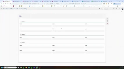
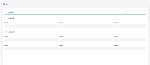
A collapsible form (or accordion form) in Power Apps is a form layout where each section has a clickable header. When users click on the header, it will expand to show the fields grouped under the section, clicking on it again will collapse it back to hide the fields, leaving only the section header name visible. 


It looks something like below: 

Benefits of using accordion forms in Power Apps

End users will thank you if you create an accordion layout when forms are long and many fields are required. Some benefits of using this layout are: 

  • Users only see what’s relevant to them at each step 
  • Collapsible sections allow to group related fields, reducing the information users see at the same time on screen. 
  • When a form is logically divided into labeled sections, users can jump straight to what they need without scrolling too much in the form, so there will be a better overall navigation. 
  • Organizing in sections will result in improved user experience on mobile because the layout breaks into bite-sized sections that feel natural to tap through. 

What you need before creating a collapsible form

First things first, plan the sections of the app and decide the following: 

  • How all the fields in the form are related or how they can be grouped 
  • How many sections the form needs 
  • How sections will be sorted, what will show first and will go at last 
  • Which fields belong to each section 
  • Which data type belongs to each field (text input, number, date, date time, dropdowns, long text) 
  • The order in which each field will go in its corresponding section 

Once you know above, it’s a good idea to create some type of prototype of how the application will look so you can have an idea of the end result that will be achieved. This can be built in a tool like Figma, Lucidchart or even a Power Point slide. 

Turn your ideas into digital solutions

Our team guides you step by step to build custom apps in Power Platform.

Below is an example of the design we want to achieve 
How to create a collapsible form in Power Apps step by step

Based on the design of the previous section, the main part to note is that all section headers look identical, only the text changes. This makes the perfect use case for a Power Apps componentWe will build the header once, reuse it as many times as we need in the form.

Step 1: Create the Section Header Component

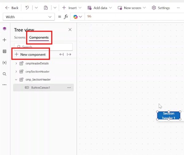
Go to the Components section in Power Apps Studio (in the left panel, switch from Screens to Components). Click New Component and rename it. good convention is to use a cmp_ prefix, so something like cmp_SectionHeader will work. 
Step 2: Add a modern button inside the component

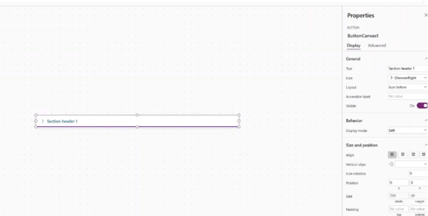
Inside the component, insert a modern Button control (it can also be a classic button if you prefer but the modern Button is ideal here because it we can add an icon and a text label in a single control very easily. 

Some properties to set on the button: 

  • Width: Parent.Width 
  • Height: Parent.Height 
  • Text: To start, write something like “Section Header”, we will change this later. 
  • Appearance: Set to Transparent so it blends into your screen design 
  • Icon: Select a ChevronRight icon (pointing right = collapsed state) 

Step 3: Add a thin separator rectangle

This is just a design decision, we want each section to have some type of separator, so, below the button, insert a Rectangle control.  

Properties to set: 

  • X: 0 
  • Width: Parent.Width 
  • Height: 1 — keep it thin, just a line 
  • Color: Match your app’s theme (e.g., purple or your brand color) 
Step 4: Create a component variable for the toggle state

Select the button inside the component and go to its OnSelect property. This is where the expand/collapse logic lives. Add the following: 

				
					Set(varCmp_ShowSection, !varCmp_ShowSection) 


Step 5: Create an Output Property to Expose the State

The app needs to know whether the user clicked a section header, so we need to expose it through a custom output property. 

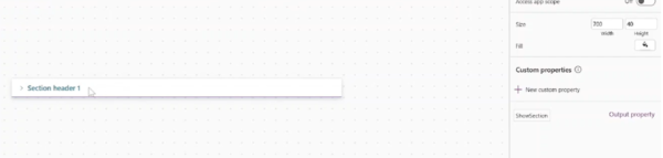
In the component panel, click New Custom Property and configure it: 

  • Name: ShowSection 
  • Type: Boolean 

Step 6: Create an input property for the section name

Now it’s time to make the section headers dynamic. So, let’s add an input property to the component so we can pass the name from the app. 

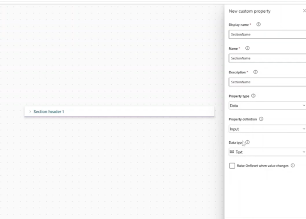
Click New Custom Property and configure it: 

  • Name: SectionName 
  • Description: The display name of the section 
  • Type: Text 
  • Direction: Input 

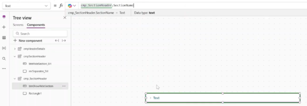
Click Create. Then go to the button’s Text property and set it to: 

				
					cmp_SectionHeader.SectionName 


Now the button will display whatever section name is passed in from the app.
Step 7: Update the chevronicon dynamically

Go to the button’s Icon property and add a conditional formula so the chevron rotates based on the section state: 

				
					If(varCmp_ShowSection, Icon.ChevronDown, Icon.ChevronRight) 


This is to show visually if the form is expanded or collapsed
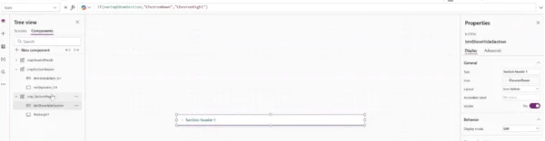
Step 8: Build the form screen

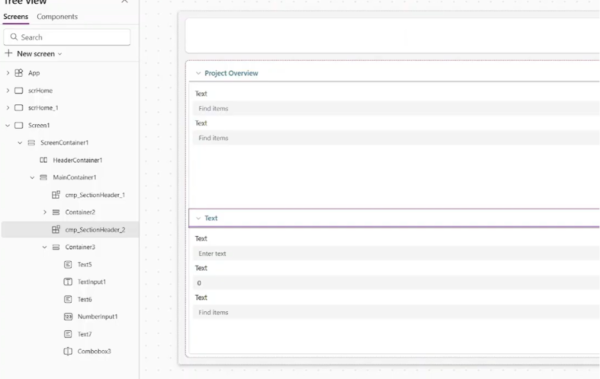
The controls, containers and layout for this step depend on your specific requirements. But to add the section headers, go to  Insert > Custom > cmp_SectionHeader. 

With the component selected, you’ll see your custom properties in the property panel. Set SectionName to the name of your first section, for example: 

From vision to execution

Whether you're just starting or scaling automation, we help turn your ideas into impactful solutions.

“Project Overview” 

Step 9: Handle the Default State on App Load

When the app first loads, varCmp_ShowSection is blank (no one has clicked yet), so all sections will be collapsed by default. If you want one or more sections to be expanded by default, we can add the following code to the Visible property: 

				
					cmp_SectionHeader1.ShowSection || IsBlank(cmp_SectionHeader1.ShowSection) 


Also update the chevron icon logic in the component to handle the blank state the same way: 

				
					If(varCmp_ShowSection || IsBlank(varCmp_ShowSection), Icon.ChevronDown, Icon.ChevronRight)


Tutorial Video: create collapsible forms in Power Apps

Watch the full step-by-step walkthrough where Graciela shows the whole process of creating the component and the form layout inside the Power Apps studio. 

Build better Power Apps with PowerGI

At Power[GI] we can help you create forms and platforms that your team will enjoy using, we bring a lot of experience in UX and UI concepts and things we’ve learnt during all of our years with experience with Power Apps. Learn about our Power Apps services or contact us today. 

Are you ready to discover the joy of automation and take your apps to the next level?

Author
Power Platform Consultant | Business Process Automation Expert
Microsoft Certified Power Platform Consultant and Solution Architect with 4+ years of experience leveraging Power Platform, Microsoft 365, and Azure to continuously discover automation opportunities and re-imagine processes.